Connect, Consult
and Care
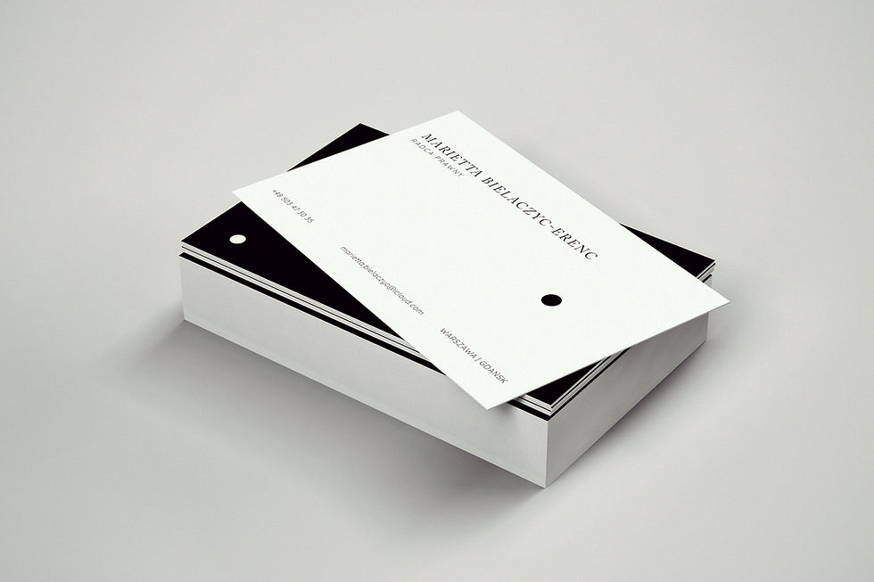
Review the branding for the law firm, including business cards, flyers, stationery, and user interface design.


Revolutionize
Your Communication Capabilities



WHAT CLIENTS SAY
It reflects our firm’s values perfectly: clear, elegant, and confident.
Design for Lawyer's office PL I EN
For this project, I developed the complete visual identity for a law office, translating its values into a clear, credible, and highly structured brand system. The aim was to create a visual language that communicates trust, precision, and professionalism while maintaining a contemporary and approachable presence across all client-facing touchpoints.
My role included the design of business cards, office stationery, brochures, and the website interface, ensuring consistency across both print and digital applications. The identity was built around a restrained and refined typographic system using Buenard and Gill Sans. Buenard, a serif based on a Transitional Roman structure and originally described as well suited to art books, brought a sense of editorial depth, stability, and formality. Gill Sans, a humanist sans serif with a long-established reputation for clarity and familiarity, added a modern, clean counterbalance and helped maintain legibility and confidence across practical communication materials.
Together, these typefaces supported a brand presence that feels precise yet accessible, traditional enough for the legal context while still visually current. The result was a cohesive identity designed to reinforce reliability, clarity, and long-term recognisability across all brand applications.
The full brand book and additional assets are available on request. Some projects are subject to restricted access.


